02 /Case Study
FXTMSEM landing page redesign
After a CRO retainer with FXTM, a Forex and Commodities trading platform, we redesigned their SEM landing page from the ground up. The redesign delivered +9.09% form completions globally and +72.86% in MENA, where the page was most underperforming.
Senior UX Designer
Users who clicked the payment banner converted at 22.55% - nearly three times the rate of users who only saw it - and the banner had no CTA.
The page felt outdated and out of step with competitors, who were all leading with their actual product. Conversion rates were low and paid media ROI was suffering. Online trading has a trust problem - there are a lot of platforms that look the part but aren't legitimate, and users arriving through search know that. Being smaller and less well-known than the big names made it harder to convince people to sign up.
My job was to identify what was blocking conversion and redesign the full page experience to fix it.
We had 6 months of experiment data from the existing baseline and previous tests. This told us which elements were already working and where to focus the redesign effort.
I analysed 10 competitors, 5 positioned at beginner traders and 5 at advanced traders. I grouped findings into themes and pulled out a set of recommendations covering messaging, layout and where FXTM could do something different.
We designed an initial landing page to test ideas and gather data before committing to the final direction. Payment logos had a high click rate and positive impact on conversion. USPs had a high conversion rate when viewed but weren't yet interactive. Plan cards and FAQs performed well. The main problem: high clicks on imagery but low clicks on CTAs.
Online trading has a trust problem. There are a lot of platforms out there that look credible but aren't, and anyone searching for a trading platform already knows that. Before they hand over any financial details, they want to know whether the company they're looking at is actually legitimate.
Jakob's Law says users spend 99% of their time on other sites, so they arrive with expectations built from competitors. Every strong competitor was leading with their actual product - screenshots, UI, payment credentials. Not matching that pattern raises questions you don't want users asking. We moved payment and security signals higher up the page so those questions got answered early.
Conversion peaked at 30% and 40% scroll depth. We concentrated high-performing content at those points and added CTAs to capture intent before it dropped off.
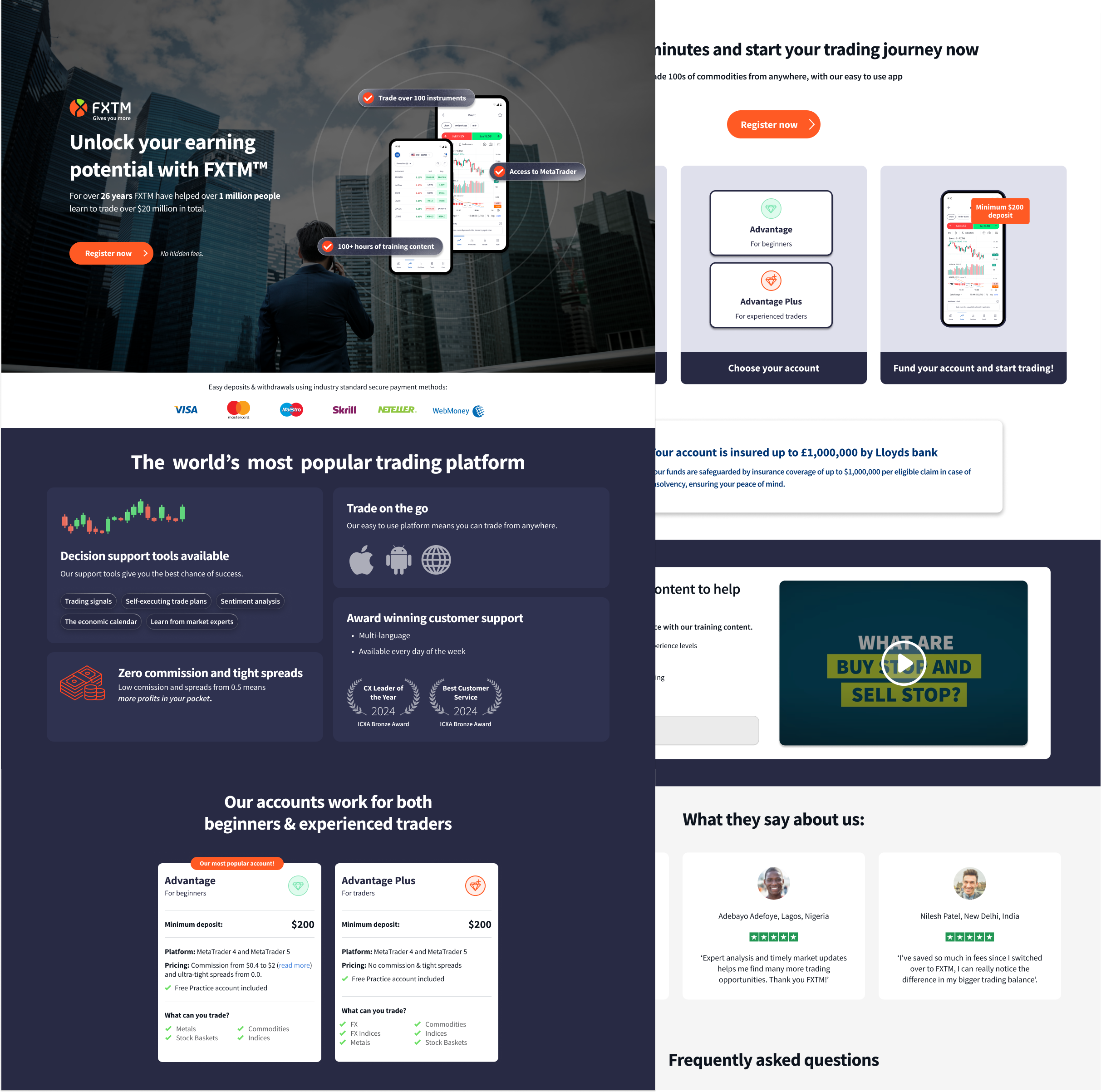
App screenshots with feature pills
Competitor analysis showed every major player led with their platform. The existing page used abstract imagery that gave users no product context. We replaced it with app screenshots and overlaid key features as pills, so users could evaluate the product before deciding whether to register.
App screenshots with feature pills overlaid in the hero.
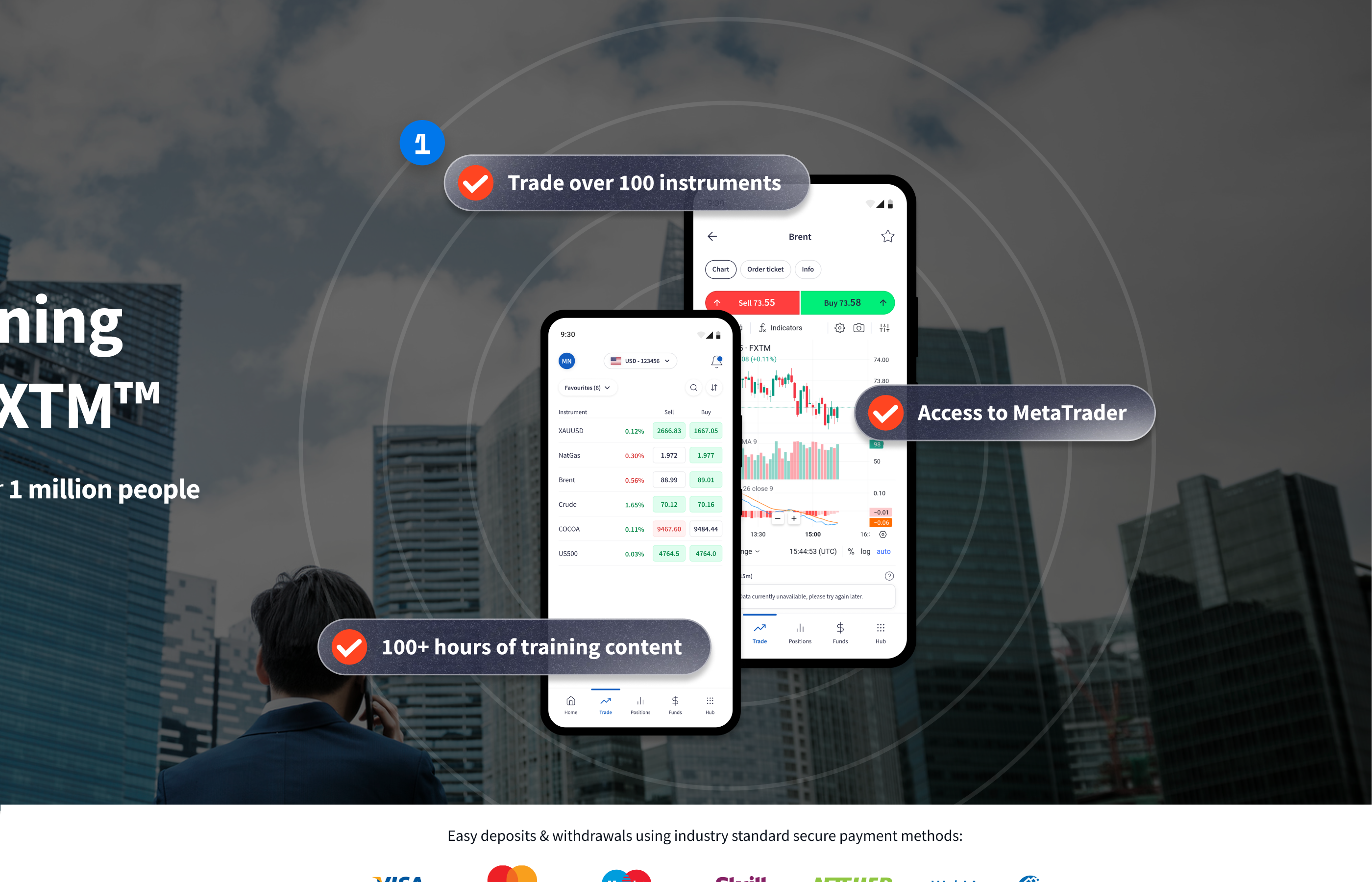
High-contrast payment method banner
The initial test showed payment logos had an extremely high click rate and positive impact on conversion. We moved them into a high-contrast banner near the top of the page where they couldn’t be missed.
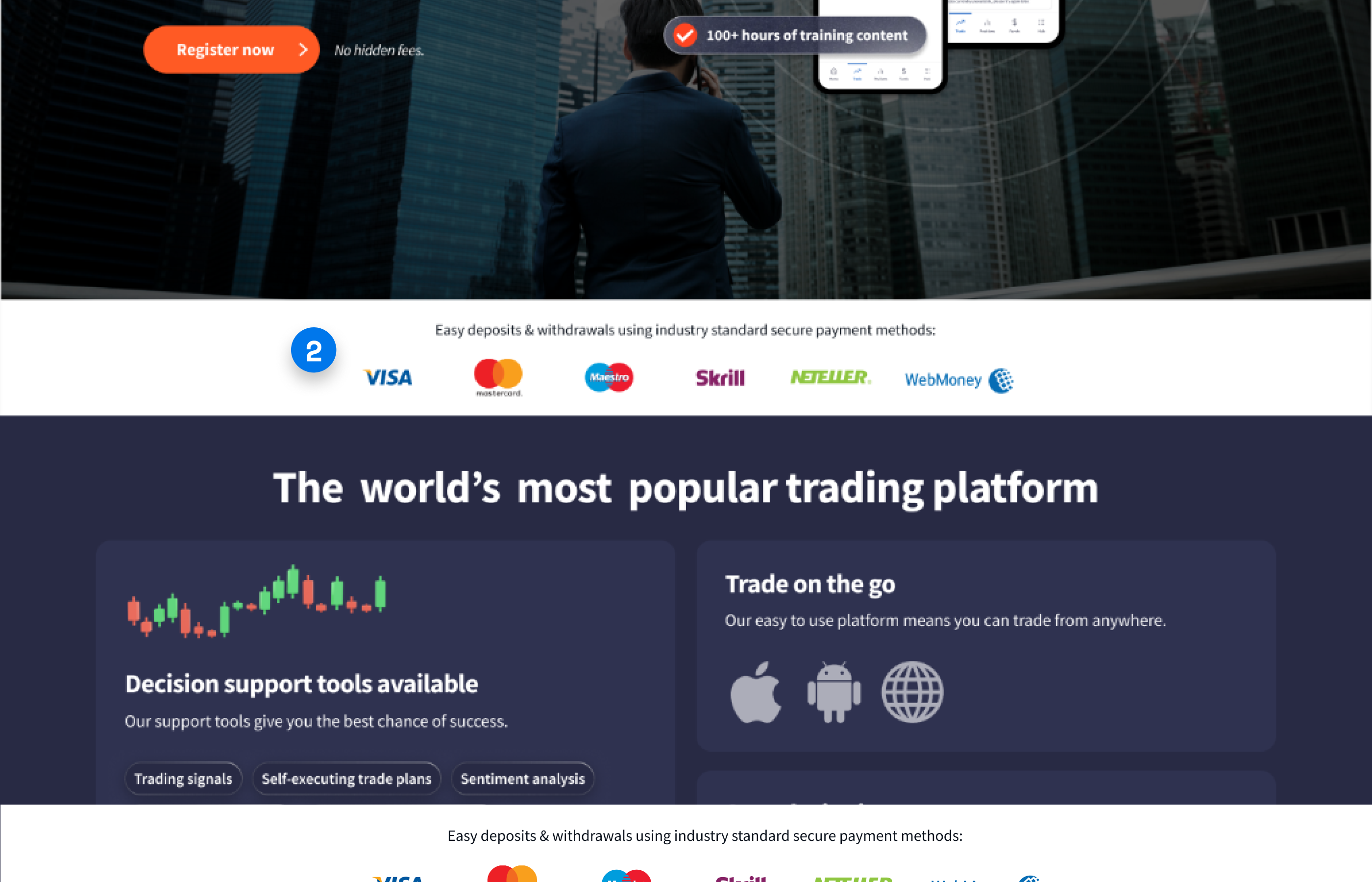
High-contrast payment banner positioned near the top of the page.
Interactive bento USPs
The original USPs had a high conversion rate when viewed but weren’t clickable. We redesigned them using a bento-box layout and made each one interactive, so users could get more detail on anything that caught their attention without leaving the page.
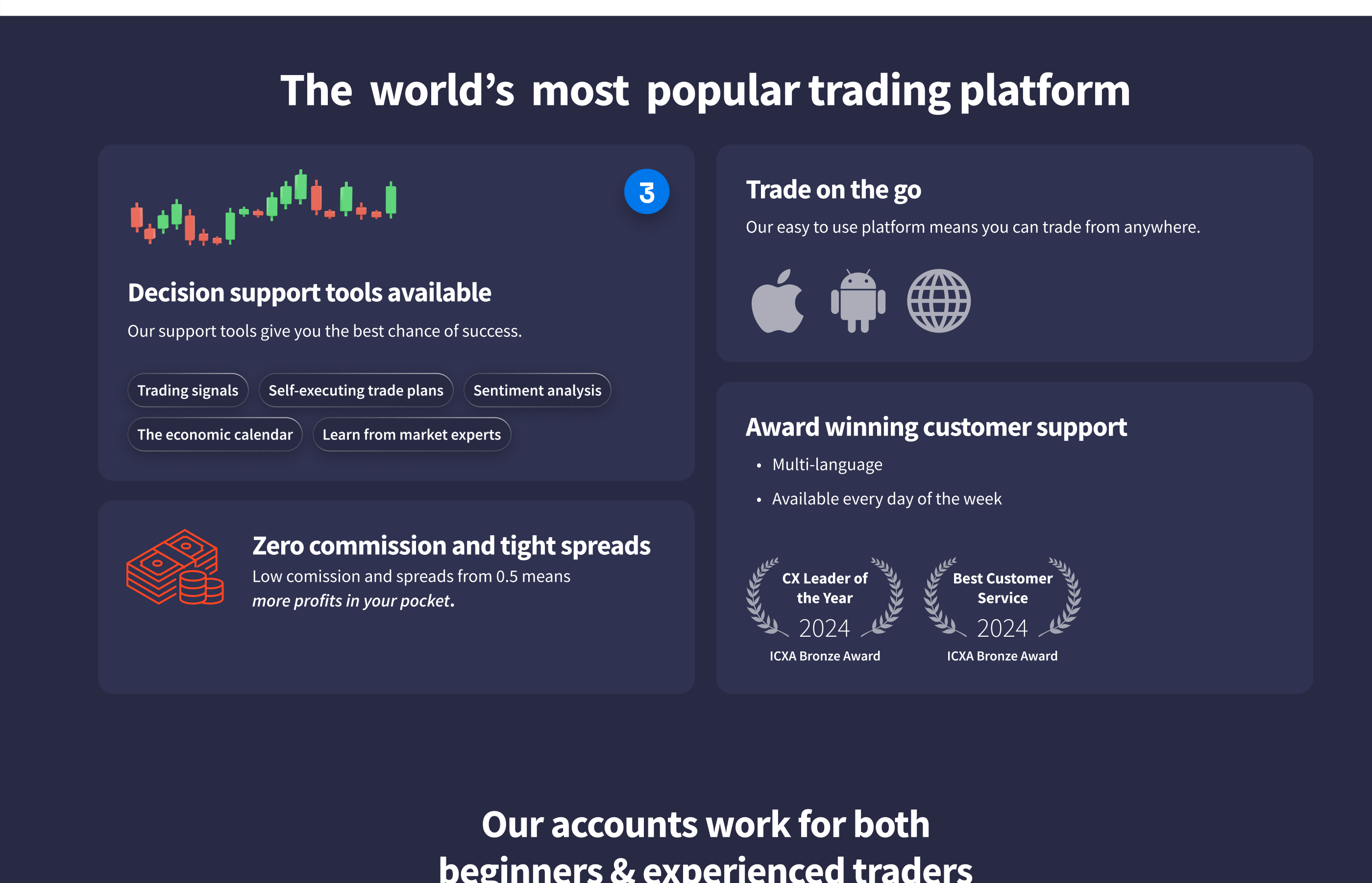
Interactive bento layout for USPs, each with a drill-down destination.
‘Best value’ framing
Plan card engagement was high in the initial test. Users were interacting but not committing. We added ‘Best value’ framing to the recommended plan to give people a clear steer on which one to pick.
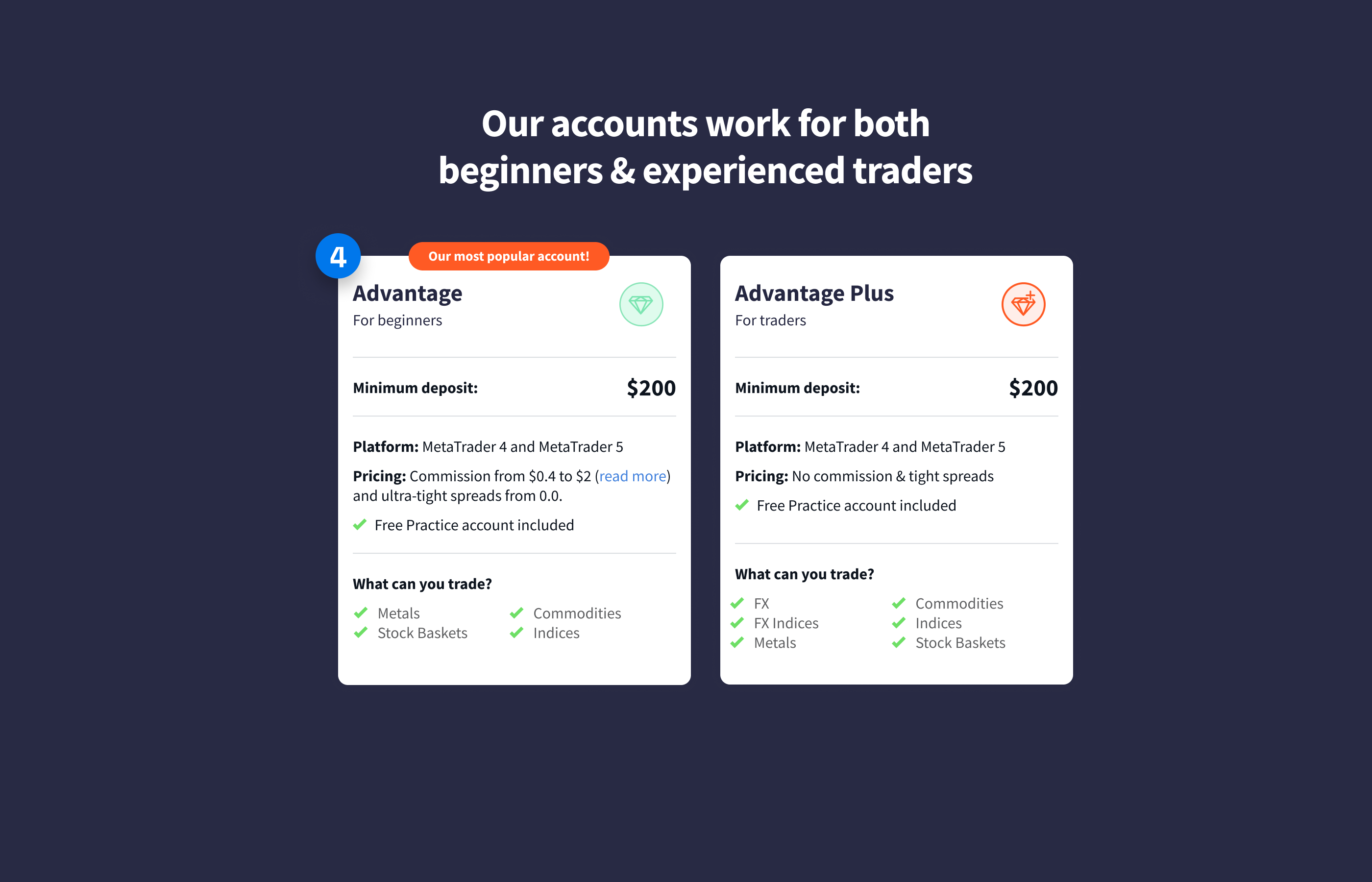
Recommended plan labelled to reduce decision paralysis.
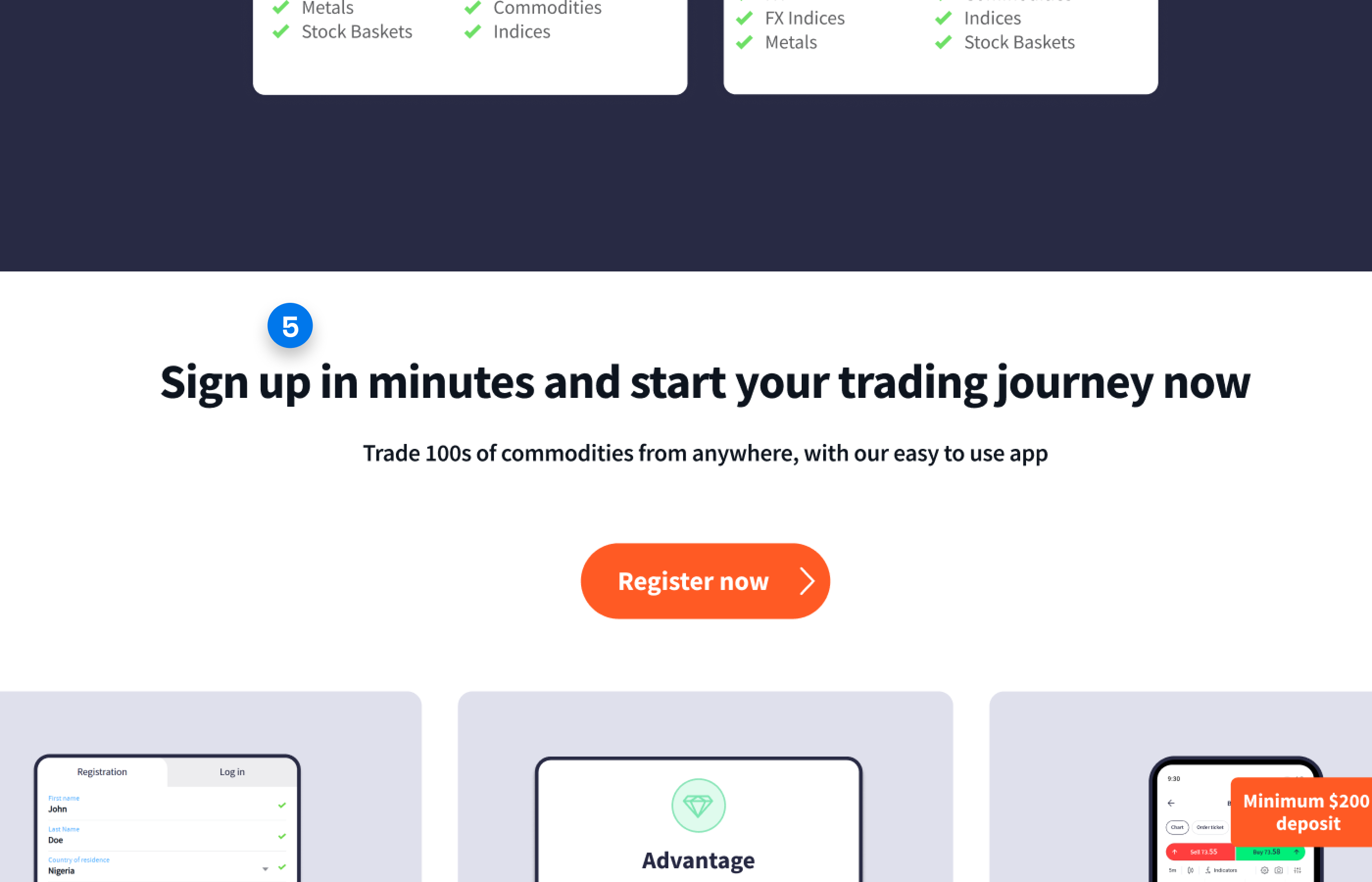
Friction-reducing signup framing
We added a headline above the signup form stating the process takes under three minutes. Knowing what comes next lowers the anxiety of committing.
Signup form framed to reduce perceived commitment friction.
Visible signup steps
We showed the steps of the signup process visually to reassure users and remove uncertainty about what happened after they clicked.
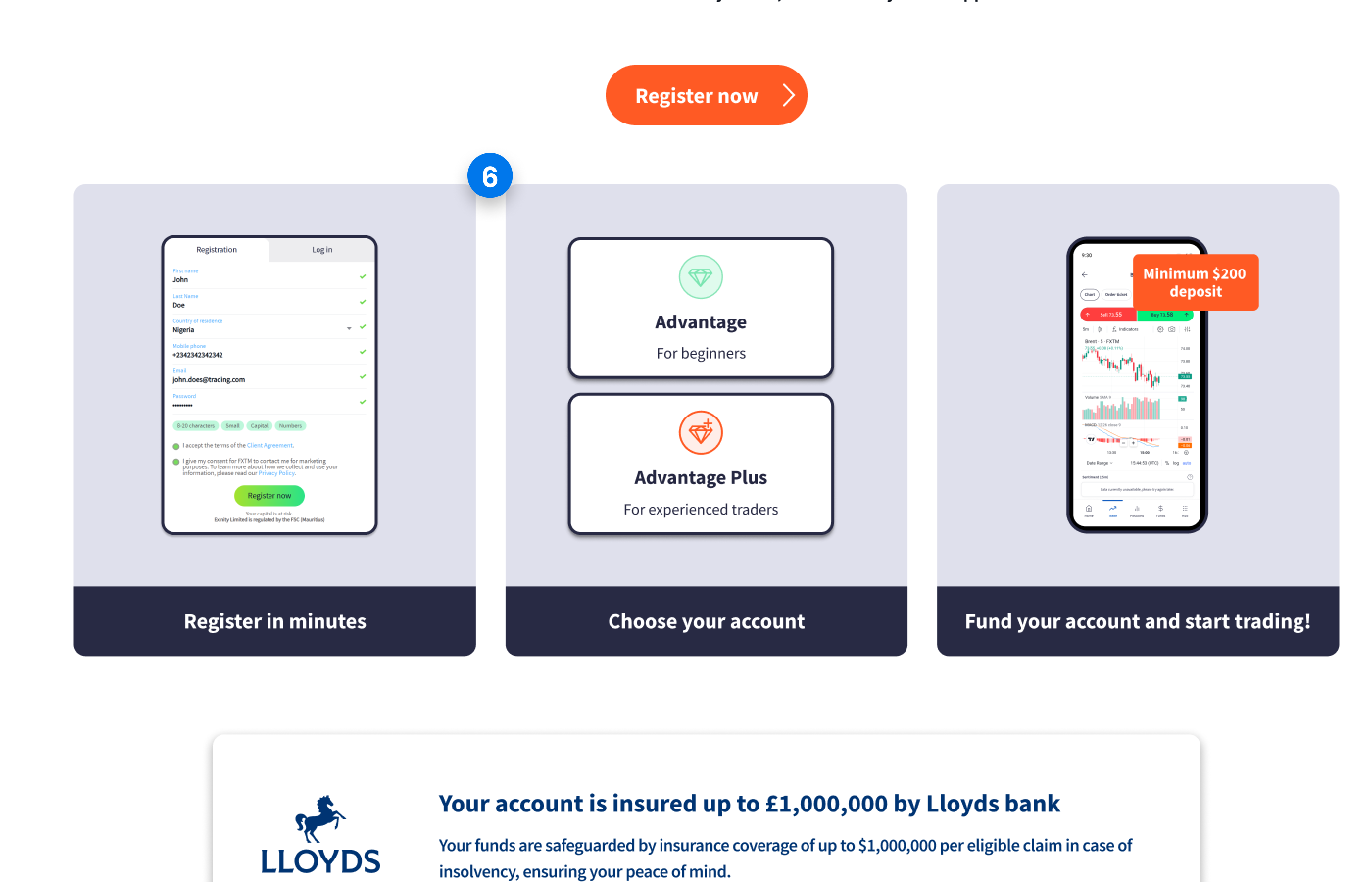
Step indicator below the signup form showing what comes next.
Training content preview
Competitor analysis showed beginner-positioned platforms used content previews to show users what they’d get access to after signing up. We added a training content snippet so newer traders could see exactly what was waiting for them.
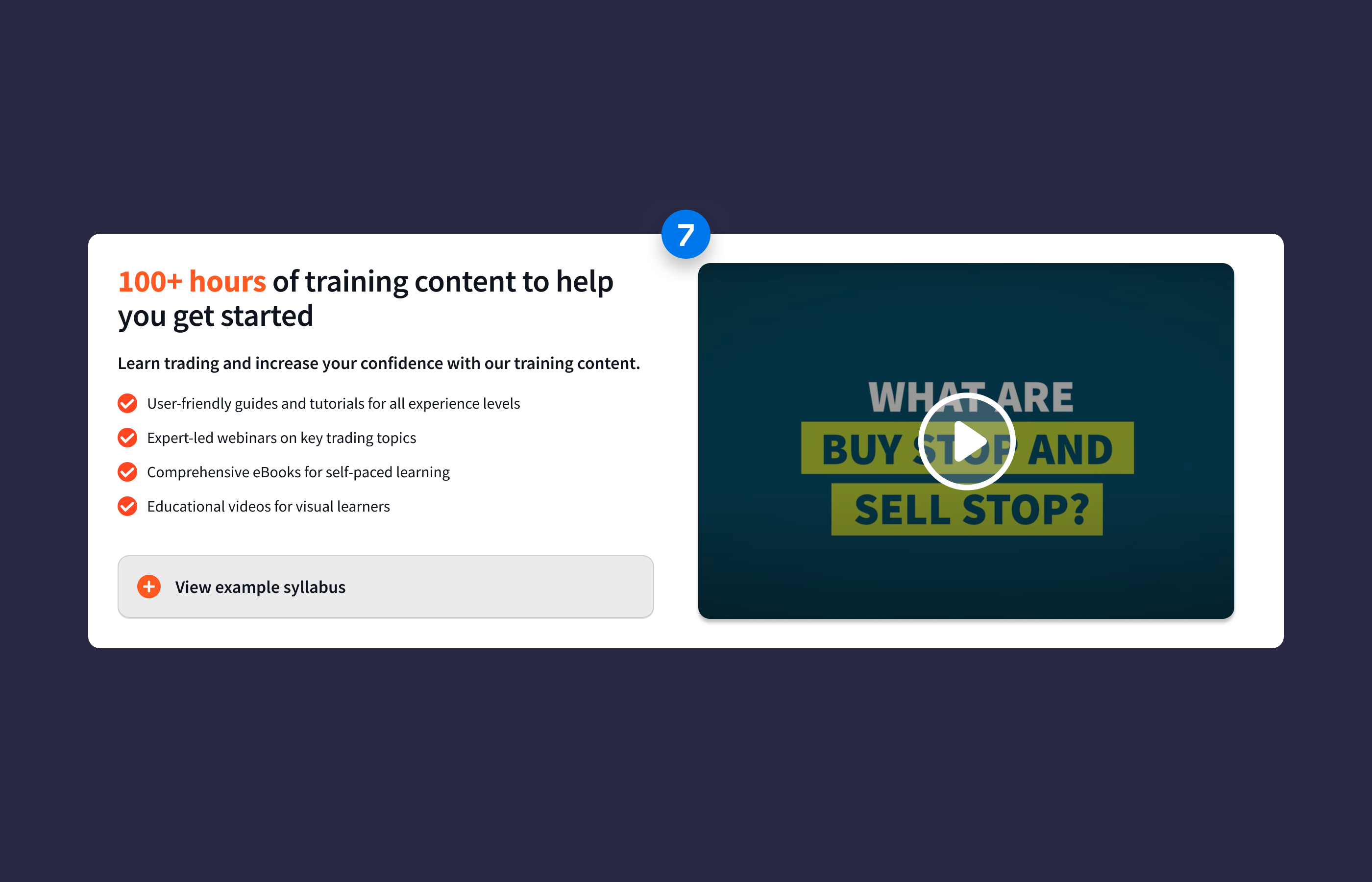
Training content preview targeting beginner traders.
FAQs tested and validated
FAQs had a strong conversion rate on other pages in the account, so we tested them here. Users who clicked through converted at a higher rate, which validated the decision to include them.
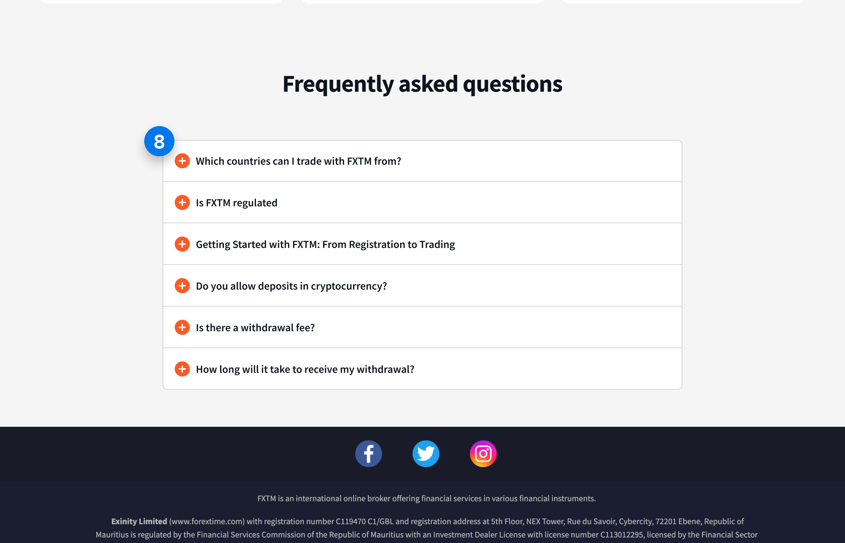
FAQ section retained based on high interaction-to-conversion rate.
The test ran across all markets from 16 January to 24 February 2025 - 39 days. Primary metric was form completions. Globally, the redesign delivered +9.09% form completions at 97% statistical significance, a clear winner. MENA was the standout: +72.86% form completions at 99% significance, with form interactions also up +20.97%. Estimated annual revenue impact in MENA was £624,542. Nigeria was inconclusive at +0.35% and 53% significance.
The redesign became the new baseline for FXTM's SEM campaigns.
Next Case Study
03 /